UX LEAD
CMS
Live Data Display.
Building on the needs of our staffing software, I led the UX for a real-time factory display system designed to make key workforce data visible where it matters most—on the floor. This is a look at how we extended our core platform to the physical workplace, improving awareness, accountability, and team coordination.
Live Data Display connects hundreds of workers across large, fast-moving plants by providing real-time operational visibility. Designed for dynamic manufacturing spaces, it helps teams track workflow, respond to changes, and make informed decisions—driving efficiency and reducing costly errors.
Timeline
1 year
Team
PM and a Product Lead
Role
Product Strategy, UX Design

Problem & Challenges
One of the core goals of this project was simple: help everyone on the floor know what’s going on with staffing—without extra back-and-forth or last-minute surprises.
Visibility (seeing the truth fast)
People needed a clear, shared view of who was here and what was missing. We tracked progress by looking at fewer attendance mistakes and fewer manual fixes in staffing records.
Stewardship (shared responsibility)
We wanted the information to feel like it belonged to the whole team, not just managers. So we used large, always-on displays with easy signals—who’s present, who’s late, and what shift changes are coming up.
Research
How I learned: I spent time on the floor at the beginning of shifts and during shift changeovers, observing how information was shared and where it broke down. I also interviewed the people closest to staffing and execution—production team members, production leaders/directors, HR, and on-site staffing agency managers.
How it shaped the design: Those conversations and observations made it clear what each group needed at a glance, which details caused delays or confusion, and where alignment mattered most—so the display could support faster handoffs and more consistent decisions.
Key Solution
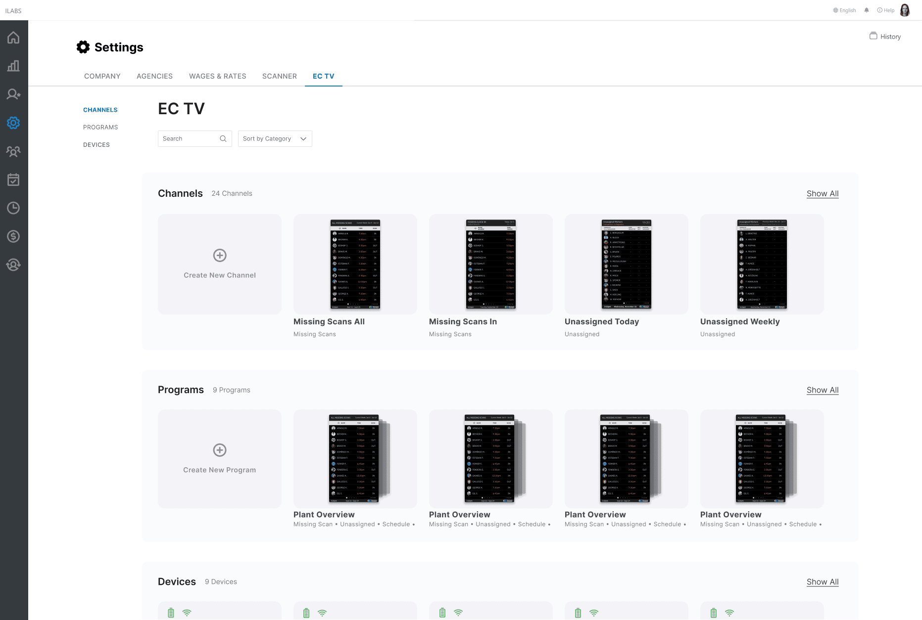
The core solution was a lightweight CMS that let admins set up, configure, and manage each display, paired with a live data view that surfaced the right information at a glance—used for things like missing timesheet reminders, attendance status, and shift scheduling updates.
Final Outcome
The display shipped and became a daily touchpoint on the floor. Clients purchased the hardware and used the screens for multiple purposes—surfacing missing timesheet data, tracking attendance, and communicating schedule changes in a shared, visible place.
How the design evolved: We treated inclusion as a requirement: adjusting the framing and content so the display felt like it was for the whole team, not a reminder aimed at a subset of workers.


Feedback
What we learned
Early feedback showed a mismatch between intent and perception. Some workers initially misunderstood the purpose—especially when the screen highlighted missing time entries—and didn’t feel included unless the message directly applied to them.
Success Metrics
Manual fixes per week
How often people had to “clean up” staffing/time records by hand.
How to calculate: Count the number of records edited manually each week (missing time, incorrect attendance, schedule mismatches). Compare before vs. after the displays.
Time to fix an issue
How quickly the team resolves problems once they appear.
How to calculate: For each issue, measure: (time fixed) − (time flagged/created). Report the average (and median) per week.
Shift-start readiness rate
Whether the shift starts with the staffing picture already clear.
How to calculate: Pick a checkpoint (e.g., 10 minutes after shift start).
Attendance mismatch rate
How often “scheduled” doesn’t match “reality."
How to calculate: At a set time (shift start / changeover), count mismatches: scheduled-but-not-present, present-but-not-scheduled, late vs. marked on-time.
Prototype
We started with a lightweight prototype to test the idea in the real world—observing shift handoffs and running quick research to validate the concept and pressure-test the core assumptions. Those early learnings helped us sharpen the use cases and, just as importantly, build confidence with prospective clients by showing a clear path from concept to value.
Content Management System
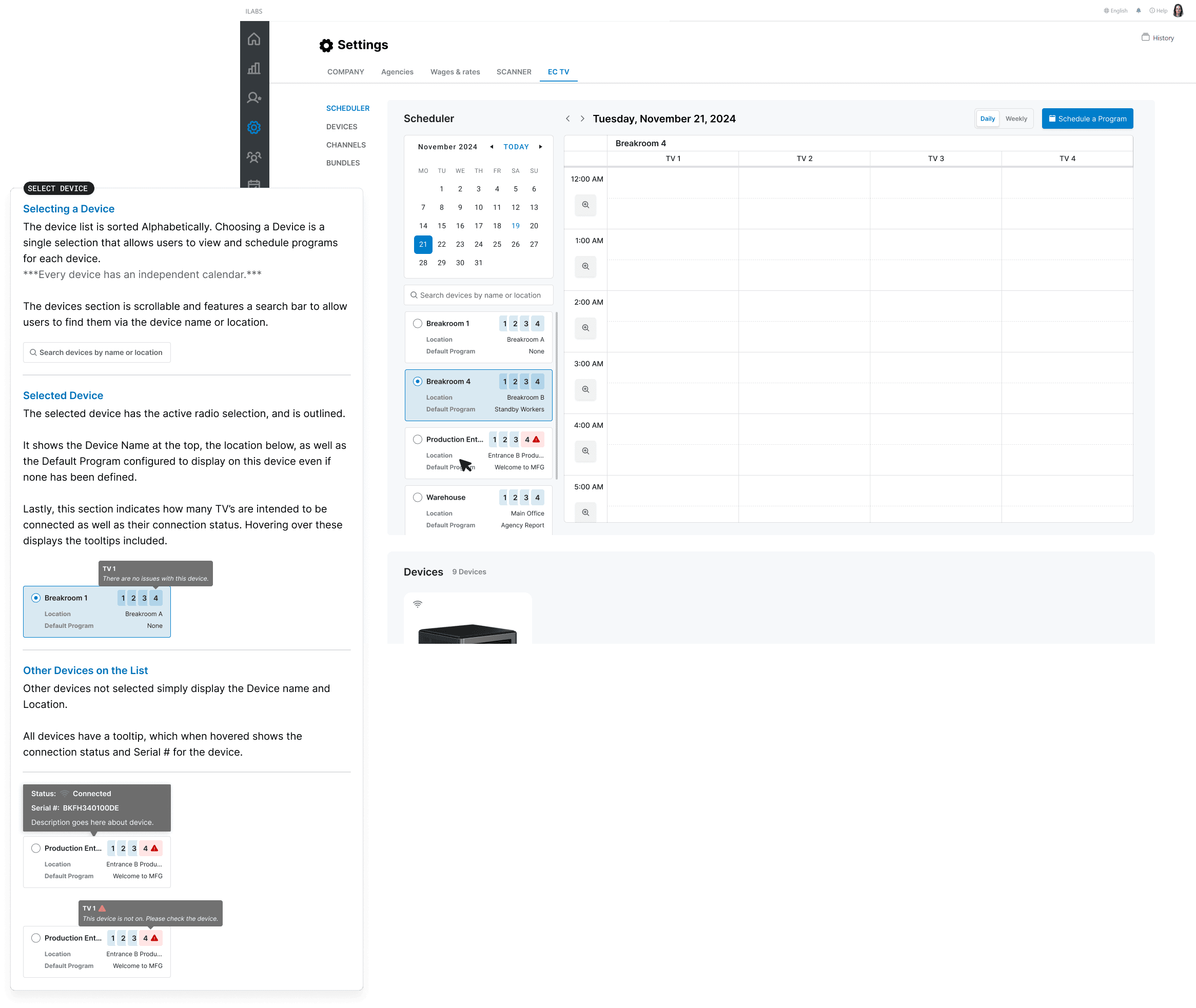
Rather than hard-coding screens, we invested in a content and resource management platform that could manage the real operational complexity behind the displays—hardware inventory, per-location configurations, and IT needs like privacy controls, IoT status monitoring, and user preferences. This decision let us scale across sites while keeping each display reliable, configurable, and supportable.

Design System
As the product expanded beyond a single use case, we established a design system and a small set of design principles to keep the experience consistent. That decision gave us a shared foundation for layout, states, and terminology—so we could add new features and display scenarios without re-litigating the basics or fragmenting the UI.
Content Scheduler
To support real operational rhythms, we introduced a scheduler that could automatically deploy the right data at the right time—especially around shift changes. This made context switching predictable and hands-off, reducing manual updates while keeping the displays aligned to what each moment on the floor actually needed.
Next Steps
With scheduling in place, the natural next step was to expand and harden it—rolling it out more broadly across sites, tightening controls, and validating that the right content shows up reliably during shift changes and other key moments. From there, we planned iterative testing to refine the scheduler’s rules and UX, then extend the platform to support additional scenarios like high-priority messaging, internal announcements/advertisements, onboarding content for new workers, and simple wayfinding on the floor.
